How To Write Powerful Calls To Action That Actually Convert In 2026 And Beyond
And Persuade Even The Most Skeptical Reader Without Being Pushy
In this post, you will learn some powerful techniques on how to create call-to-action buttons that convert.
The CTA button is, after the headline, the second most important element of your copy. It’s the magic button that tells people what to do next.
The effectiveness of your CTA buttons also helps you to understand if your copy was or wasn’t engaging enough for your prospect to click on it.
There is a study behind every call to action. Writing an effective call to action is not easy, but if you follow some techniques, you can write irresistible CTAs.
As a copywriter, your priority is writing the right word to the right person, without worrying too much about fancy design.
You also have to know what kind of copy you have to write so you can decide the tone for your CTA.
And not only that. There are other elements that you need to pay attention to if you want to write high-converting CTAs.
Choosing the right color, font, and shape is what makes the difference in the overall button creation.
In this post, I am going to analyze a real email I received a while ago to show you the do’s and don’ts of an effective call to action.
It’s written in Italian, but that’s not important. What matters most in this post is not the language of the case study, but the overall structure of the email and the effectiveness (zero, in this case) of the CTA button.
I actually received this email, and I couldn’t believe what I was reading. From the first moment I read it, I decided to share it with you and use it as a case study for this post about CTAs.
That's because it was the worst example of email marketing I’ve ever seen. I’m sorry for the writer, but that’s the truth.
But before analyzing the case study, let’s delve deeper into the main topic: the calls to action.
Let's get started!
What a call to action (CTA) is.
A CTA, or call to action, is the button in your copy, email, sales letter, blog post, and all marketing copy you write.
It has only one purpose: to tell your prospects exactly what action they have to take after reading your copy.
The CTA is the result of an accurate analysis of your copy.
Before writing it, you have to:
Think about the goal of your copy (lead generation, sales, website traffic, etc.)
Know your audience, their problems, needs, and pain points
Ask yourself if your call to action answers the question your prospects think when they read your copy:
👉 “What’s In It For Me?” (W.I.I.F.M.)Decide what action you want them to take.
Don’t use standard CTAs that have nothing to do with the purpose of your copy.
How To Write CTAs That Convert: Best Practices.
Your prospects will click your CTA button if the content of your copy is something valuable that benefits them.
The perfect call to action starts with an action verb. Be clear and concise.
You can use creativity and humor to write your CTA, but only if these fit with your kind of business.
To write compelling CTAs, you have to know and apply the principles of persuasion like urgency and scarcity.
Some examples of CTA in context:
-Headline: Join The Copy Club Today. Your $200 Discount Expires At Midnight.
-CTA: Save Big Today
-Headline: Kick Off Your Seasonal Sales With A 30% Off Only For You
-CTA: Get Your 30% Off
-Headline: Flash Sale ⚡️New Courses For Just $9.99 Ends Sunday At Midnight
-CTA: Unlock Your Lifetime Access Today
-Headline: 100 Early-Bird Free Tickets For The Event “Woman In Tech”. Don’t miss out!
-CTA: Save Your Seat Before It’s Gone
Another important strategy for writing effective CTAs is using power words like “Free”, “Save”, “Get”, "Unlock", “Now”. Some examples can be:
Get Your Free Ebook Now
Start for free
Save big
Personalization works well in CTAs too, because it directly addresses your readers, and they feel more motivated to buy.
Words like “your” and “my” convert more than generic calls to action.
For example:
“Download Now” is generic.
“Download Your Guide Now” is personalized and more effective.
To strengthen your call to action and encourage your readers to hit the CTA button, you can add a risk reversal clause before or after your CTA. For example: "Cancel Anytime", " Money Back Guarantee", “No credit card required”, etc.
As I mentioned above, the CTA is the second most important element of your copy after the headline.
So it must stand out from the rest of your copy, and the font size of your CTA has to be bigger than that of the body font. But remember, it must never be bigger than the headline.
Furthermore, I recommend choosing the same font for every call to action in your copy for consistency and to avoid confusing your readers when they look at your CTA buttons.
The only case you can use different fonts, or the same font family with a different weight, to create visual hierarchy is if you have two different calls to action with different purposes.
For example, if you have a primary and a secondary CTA, you can choose a font for the primary CTA and another one for the secondary CTA.
Or you can use, as I’ve mentioned before, the same typeface with different weights, for example, bold, regular, italic.
But it’s not a rule of thumb. You can use the same font for both CTAs if you want.
How To Choose The Color For Your CTA.
It must be in contrast with the rest of your copy to be visible.
The most used colors are blue, gray, black, red, and orange.
But recently, studying and analyzing some websites and landing pages, I’ve noticed that purple, magenta, and CTA buttons with a transparent background (“ghost” buttons) are also used.
Remember, the color of your CTA depends on the type of your site, the business you’re running and the message you want to convey.
Knowing color psychology is essential because every color has a meaning and plays an important role in customer engagement.
Here is the meaning of some colors:
Blue: Calm, relax, confidence, honesty, loyalty, trust.
Green: Balance, growth, rebirth, money, health, nature.
Red: Strength, desire, passion, determination, energy.
Orange: Optimism, adventure, sophistication, change.
Yellow: joy, happiness, energy, optimism, self-esteem.
Purple: Luxury, boldness, spirituality, vision, wisdom.
Magenta: self-respect, happiness, kindness, free spirit.
Another important factor to consider when you pick a color for your CTA is testing what color converts best.
A/B testing your CTAs is a good strategy, so you can analyze the analytics and see which CTA converts better.
You can run A/B tests on:
CTA buttons’ color
CTA positioning
CTA types
Font color
Typeface
What’s The Right Shape For Your CTAs?
It depends on the purpose and design of your copy.
You can choose between a CTA with rounded angles (my favorite) or squared angles.
Rounded CTAs often perform better. That’s not only a matter of design, but it also has a psychological meaning.
Rounded buttons are perceived as safer and more user-friendly.
And some research shows that they have a higher conversion rate than square CTA buttons.
And What About The Size?
The size of a CTA depends on different factors. Your priority, especially in 2026, is the mobile-first optimization mindset.
The size of mobile CTA buttons is different from that of the desktop version.
For mobile devices, a CTA must be visible and clickable without scrolling and bigger than desktop CTAs.
Always remember that no matter the device, the CTA button must be proportionate to other elements on the page, but a little larger than them.
According to Apple’s guidelines, the ideal minimum size for thumb-friendly CTA buttons for mobile devices is 44×44 pixels.
The optimal recommended size is 60 - 72 pixels in height. But it can be bigger if you want. And you can also use a full-width CTA.
It’s important to add white space or padding around CTA buttons to avoid people clicking on links they don’t want to click on. The ideal space is 8 -16 pixels.
The recommended CTA button size for desktop is 48 - 60 pixels in height.
For the white space around the desktop CTA button, you can opt for an ample vertical padding with a recommended size of 8 -10 pixels.
The importance of CTA placement.
If you want to increase conversions, place your CTA buttons strategically.
Above the fold:Place your CTA in a way that is visible and clickable without scrolling.
After testimonials and social proof. (Inline CTAs)Use testimonials and social proof to motivate and persuade your readers, and then add a clear CTA.
At the end of your copy: add a CTA at the end of your copy to increase conversion because your readers are now educated and informed about your offer and are ready to buy.
Sticky or floating: you can place this CTA at the bottom or at the top of the screen. When readers scroll down, it’s visible, and it sticks.
A Case Study To Help You Avoid The Same Mistakes.
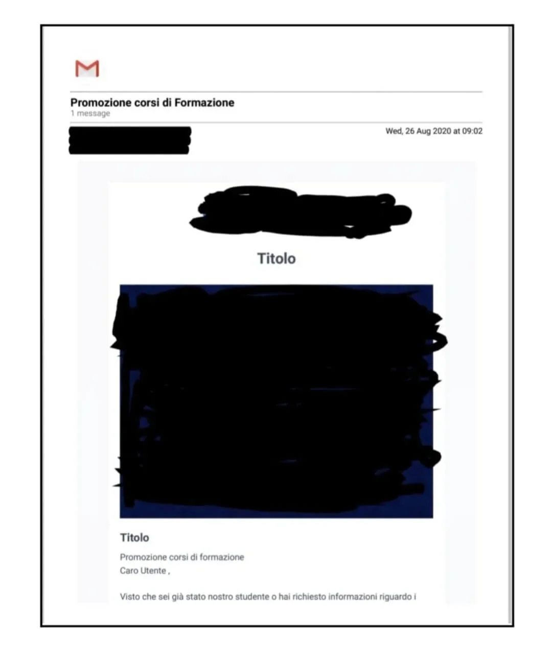
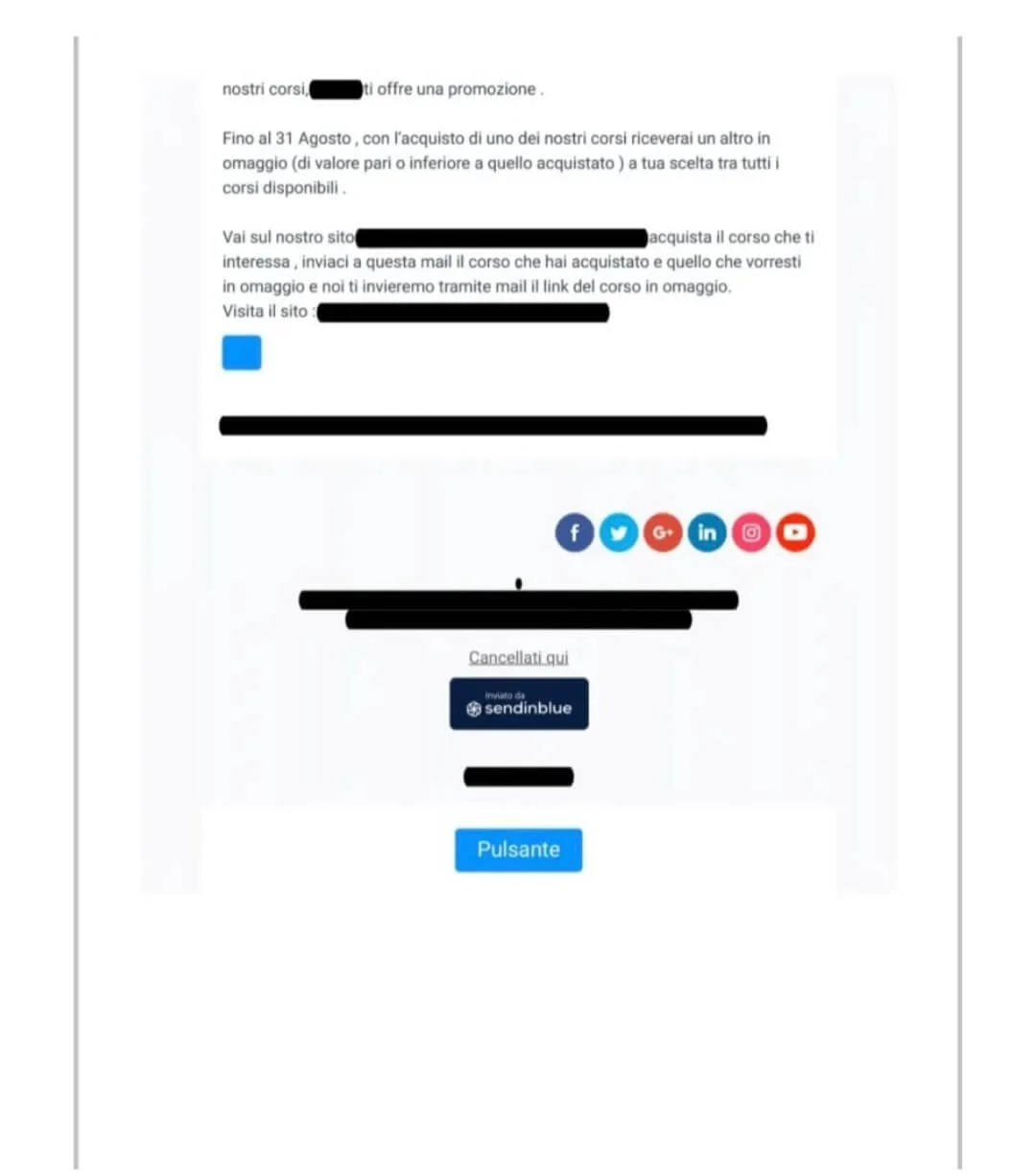
This is the email I mentioned above. I’ve decided to use it as a case study because it's the perfect example of how an email and a call to action mustn’t be.
I have hidden the Company name for privacy.
Let’s break it down:
Source From The Author
Source From The Author
I know the topic of this post is not email marketing, but before getting to the CTA, I want to analyze and show you every single part because it's incorrect as a whole.
And above all, it has the worst CTA buttons anyone could have written. It’s a zero-list-building button, zero marketing strategy, and last but not least, zero expertise.
Case study Analysis: Training course offer.
First of all, never use a template without customizing your copy.
Secondly, “Titolo” means that you have to write a Headline and a Subhead, and not use “Titolo” as the headline and Subhead too. It has no meaning, and it speaks to no one.
The headline is key to a compelling message to draw attention.
When you write an email for marketing purposes, there is nothing more wrong than addressing the recipient with a general tone.
And the worst thing is that what the sender claims is not absolutely true: the recipient, in this case, me, is a previous client. I’d remember it if it were true.
Cheating a reader, a prospect, or even a loyal client is the worst choice a brand could make, because people who read remember well the brands they bought from, even if it’s a one-time purchase.
So remember, if you lie to your readers, you will lose future customers. People buy only from brands they trust. And if you try to sell something by swindling them, you will never be trusted, and they will never buy from you.
Being transparent and honest with your readers or prospects is mandatory.
Let’s go back to the example above.
The promotion of the training course is totally wrong. It's not for the offer, but for the way it is presented to the recipient. I believe that no one would like to answer an email like this.
The offer of a product or service must be clear and transparent, without cheating a prospect because, as I said above, there is no loyalty without trust.
And last but not least, the topic of this post: the magic button. A CTA like this is a nightmare for every copywriter, even for a newbie.
The CTA in this email is: “PULSANTE”. It's TOTALLY WRONG! It’s clearly unprofessional; even ChatGPT can do better than that.
With a CTA like this, how can a prospect understand what is the action to take?
And what is the benefit of this action? Maybe the first course? Or the course he/she will have for free after buying the other course? What a mess!
I can’t help but share this email with you and analyze it.
It was really a shock to read it, but it was also proof that knowledge and applying what you learned make a difference.
Nothing wrong with using templates, but without customization, whether you’re writing an email, a landing page, or a website page, you’re making a huge mistake in every part of your copy, especially for CTA buttons that are what lead people to the most important step of the purchasing process.
Final thoughts.
The basics for creating a CTA button that works are clarity. And writing copy and CTAs that convert requires work, preparation, and studying the psychology of persuasion.
But what matters most is that you have to write not only to sell something to make money, but also to provide real value.
Your main goal is to make your readers’ lives better.
If you think only about your profit, you’ll be absolutely wrong.
First of all, you have to think about your readers, the problem they have, and how the action they take will solve their problem or change their lives.
Only then can you write tailored and valuable content to build trust, with personalized and benefit-driven CTAs that people want to click.
To write a compelling CTA, you need a lot of practice and, why not, even errors.
But it’s crystal clear that effective CTAs are not the result of using templates without customizing them.
Then, A/B testing your CTA is the best way to analyze which CTA button converts best.
Remember, for a compelling CTA, the most important thing is to know your audience and understand their needs and problems, so you can write tailored copy and CTA buttons that speak to them in a more honest way.
Otherwise, your email will be a disaster like the case study above, and your call to action will be such a brain-teaser for your prospects, and the only result you will get is losing them.
That’s my short guide about CTAs for you.
Note: This article was originally published on Medium
Disclosure: The links in this post are not affiliate links. So if you click on them, make a purchase, or buy a subscription, I don’t earn any commissions.
Have a copywriting project in mind?
Whether you have a question about this article or want to discuss your next campaign, I’d love to connect. Click below to request your free audit and start the conversation.